
This story is part of our Weekend Reads series, where we highlight a story we love from the archives. It was originally published online in January, 2022.
What are you seeing?
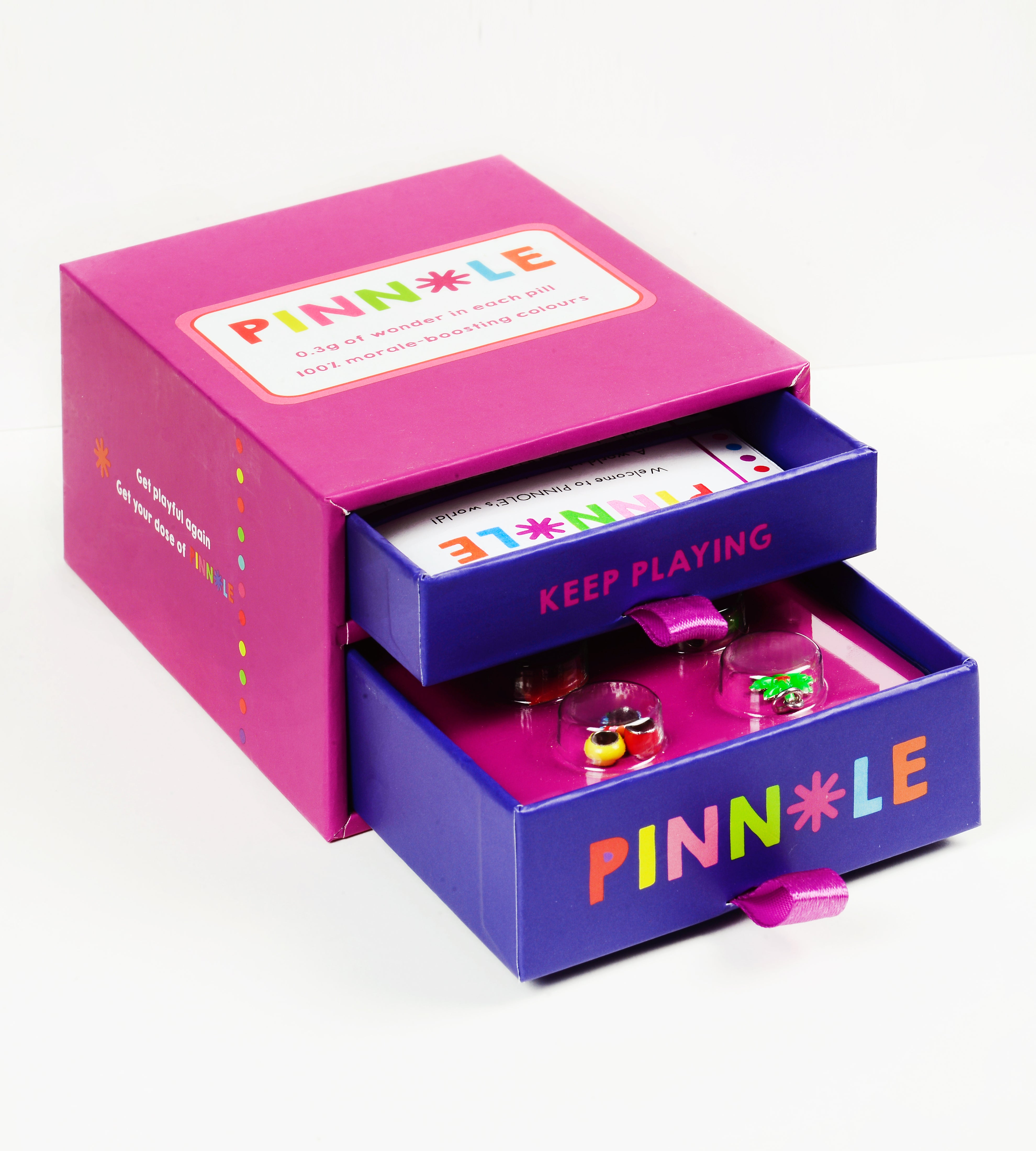
Layered, type-driven design inspired by 1980s advertising is on the rise, and along with it, a worthy opponent (finally) for the sleek, buttoned-up visual world of the last decade. In its purest iteration, the throwback ’80s editorial trend is text-heavy, with layouts comprised of a single, often silhouetted or gradient-backed image, a punchy headline, and supporting narrative copy. The most recognizable component of the trend is arguably its widespread use of condensed serifs like ITC Garamond Condensed or Editorial New—typefaces that just a few years ago would have been relegated to body copy, and certainly never run large as headlines with such tight tracking—as well as the occasional bold sans (a holdover from the Lubalin era) like ITC Kabel.
This aesthetic is most readily associated with 1980s advertisements by Apple, which pioneered the look with its launch campaign for the 1984 Macintosh, along with New Balance (Steve Jobs’ shoe of choice: a coincidence?) and car companies like Honda or Dodge. Arguably, this narrative approach to selling products can be traced back even further, to 1960s advertising titans like William Bernbach and David Ogilvy’s respective work for VW and Schweppes.

The current trend also includes an increase in visual motifs that cue physicality and real-world materials, even within brands that are exclusively digital. Think: film grain, VHS dithering, airbrush art, and faux paper backgrounds. This interest in throwback textures even extends to art direction and styling, with more photoshoots incorporating old-school tech like fax machines, cassette tapes, and brick phones as props (an occurrence mirrored in the adjacent return of low-fi 2000s tech like wired earphones). Like all trends of the “big flat now” that is 2022, the ’80s editorial aesthetic has many sub-genres and close cousins, ranging from neon script to monochrome euro-luxe. But, at their core, these offshoots are all unified by a mutual renewed interest in a balanced relationship between copy and image, as well as a return to tactility.

Who’s using it?
The trend has mostly appeared in brand identity and campaign work, particularly in the fashion and lifestyle worlds (which always seem to hit on a new visual style before it trickles down to consumer packaged goods and tech). Eighties editorial style design has been seen in recent campaigns from Skims, Nike Yoga, and Amélie Pichard, as well as, unsurprisingly, in a slate of recent New Balance collaborations, including Aime Leon Dore, Casablanca, and Staud. Still emerging is the trend’s appearance in a few new food brands, like the just-launched Graza or bespoke beverage brand Lark.


Comments
demo
ddtest